
- Dashboard settings shows various graphs
- User can select max 12 graphs from dashboard settings
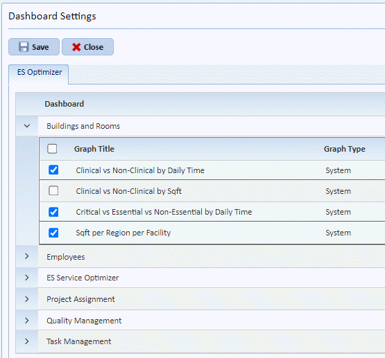
- By default, following graphs are shown for all users-
1. QA Passing Rate - Gauge
2. QA Room Inspected - Gauge
3. QA Completed vs Incomplete – Bar chart
4. Project Hours Completed – Bar chart
5. Task Open Vs Closed – Pie chart
6. Critical vs Essential vs Non-Essential by Daily Time – Pie chart
7. Clinical vs Non-Clinical by Daily Time – Pie chart
8. Employees per Shift – Pie chart
9. Sqft per Building per Facility – Pie chart