The dashboard contains five preset graphs: UVC
Operator Productivity, HCAPS to PATSAT Scores, Infections Vs Blacklight Passing,
Infections Vs Quality Score, and Infections Vs Blacklight Inspections.
The Sterile Trakks Dashboard is shown below.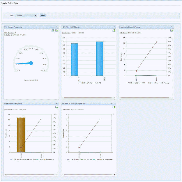
1. You may change the time frame displayed in all graphs using the Date dropdown as shown below:
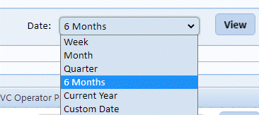
2. Select the date range desired and then select view.
3. Some
graphs have additional filtering capabilities available via the Filter Icon  as shown below.
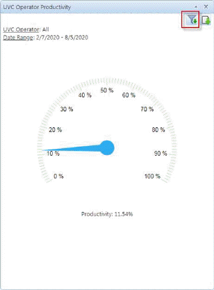
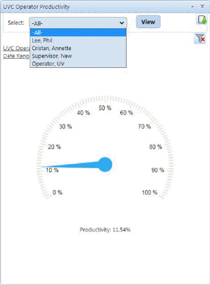
4. User
may select a user and click the view button  to see the results in graphic form.
5. When
you are finished you may use the close filter button  to return to the standard view.
6. User
may also export the graph and save it to attach to an email or include in a
report by using the Export Graph button  .
.